- Published on
Intro
- Author
-
-
- Name
- Posts
- Posts
-

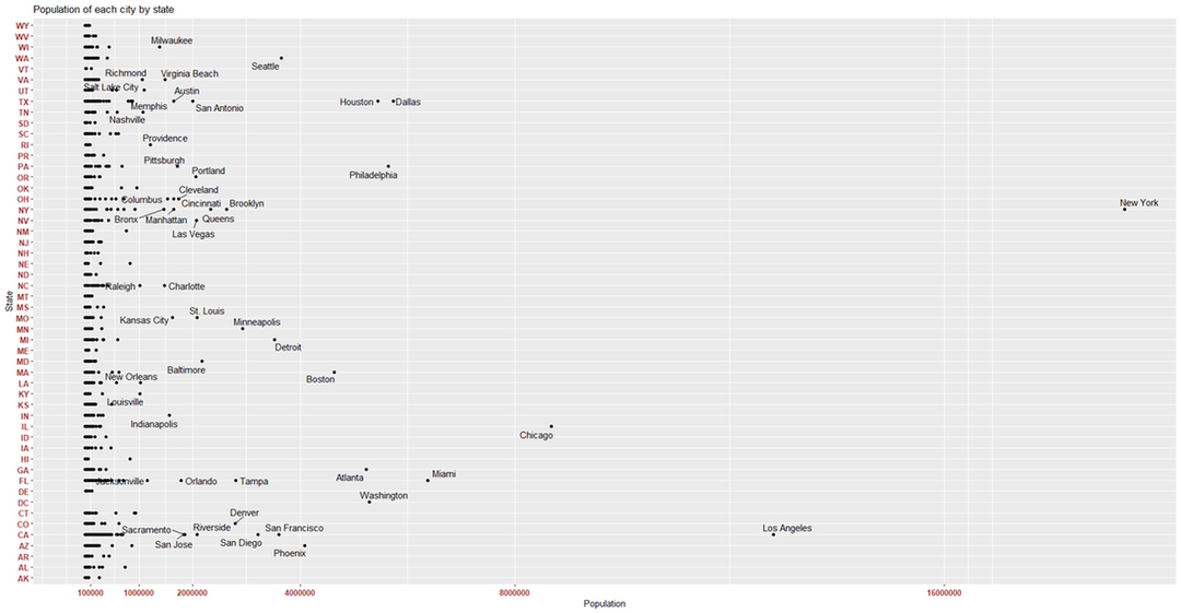
For starters there are many things in common between urban centers such as New York, Chicago, and LA. They all have very concentrated population densities (as expected of Urban areas) and a large population.
library(plyr)
library(lubridate)
library(ggplot2)
library(dplyr)
library(data.table)
library(ggrepel)
library(tidyverse)
library(ggmap)
#Installation for ggmap package here. Make sure you register your google api key #with register_google(key = " ")
library(sp)
library(rgdal)
library(geosphere)
library(readxl)
library(matrixStats)
library(magick)
#R will generally install any missing packages.
#Here is a quick plot I created with the data provided up there
uscitiesold <- read_csv("C://Users//Daniel//Desktop//ExcelStuff//uscities.csv")
#view(uscitiesold)
options(scipen=999)
ggplot(data = uscitiesold, aes(population, state_id)) +
geom_point() +
geom_text_repel(data = subset(uscitiesold, population > 1000000), aes(label = city),
) +
theme(axis.text.x = element_text(face="bold", color="#993333",
size=10, angle=0),
axis.text.y = element_text(face="bold", color="#993333",
size=10, angle=0)) +
scale_x_continuous("Population", breaks =c(100000,1000000,2000000,4000000,8000000,16000000))+
scale_y_discrete("State") +
ggtitle("Population of each city by state")+
windows()
#Feel free to play around with the numbers. To break down this code for beginners:
#read_csv reads an excel file on my computer with a path to that file. I keep it in a folder.
#options(scipen=999) is taken from here. all I am doing is removing scientific notation from my plot
#geom_text_repel is using the ggrepel package. I am separating labels. More here. Notice how
#I subsetted the labels to only label everything over a population of 1 million You can change this to see how it looks.
#To make my numbers more visible I added the theme() line. More here on how to customize labels and tick marks
#scale_x_continuous takes the scale (which is the x axis of 'population'). I labeled it "Population", and
# added breaks that are visible in the plot below on the x-axis. More on this here
# ggtitle just adds a title to the plot.
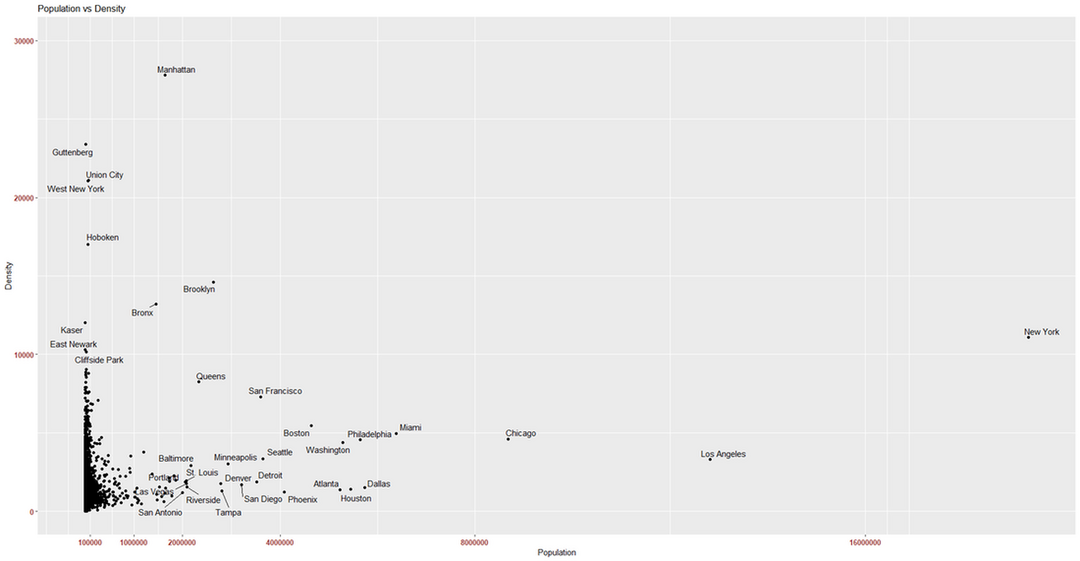
ggplot(data = uscitiesold, aes(population, density)) +
geom_point() +
geom_text_repel(data = subset(uscitiesold, population > 2000000 | density > 10000), aes(label = city),
) +
theme(axis.text.x = element_text(face="bold", color="#993333",
size=10, angle=0),
axis.text.y = element_text(face="bold", color="#993333",
size=10, angle=0)) +
scale_x_continuous("Population", breaks =c(100000,1000000,2000000,4000000,8000000,16000000))+
scale_y_continuous("Density", limits = c(0,30000)) +
ggtitle("Population vs Density")+
windows()
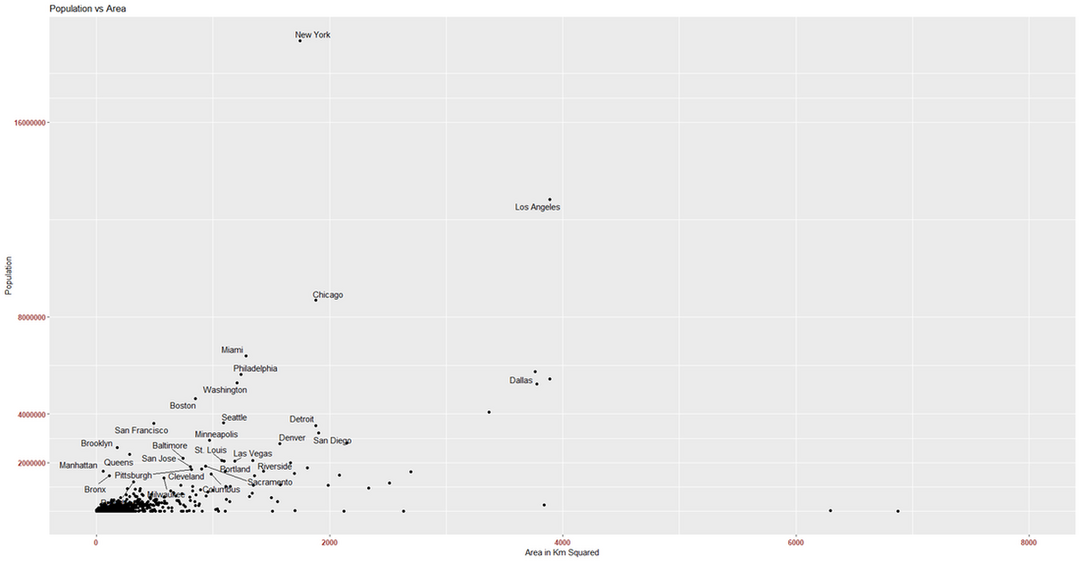
Here is a chart comparing population and area- which are the components of population density.
options(scipen=999)
uscitiesarea <- uscitiesold %>% mutate(area_km2 = population/density)
uscitiesarea <- uscitiesarea %>% filter(area_km2 < 100000)
view(uscitiesarea)
ggplot(data = uscitiesarea, aes(area_km2,population)) +
geom_point() +
geom_text_repel(data = subset(uscitiesarea, population > 1000000 & density > 1500), aes(label = city),
) +
theme(axis.text.x = element_text(face="bold", color="#993333",
size=10, angle=0),
axis.text.y = element_text(face="bold", color="#993333",
size=10, angle=0)) +
scale_x_continuous("Area in Km Squared", limits = c(0,8000))+
scale_y_continuous("Population", breaks =c(2000000,4000000,8000000,16000000)) +
ggtitle("Population vs Area")+
windows()
So what do urban centers have in common (disregarding population)?
Urban centers generally have many stores, food chain restaurants, a higher standard of living, and a lot of infrastructure. Urban centers also have parks, easy access to healthcare and apartments for living space. The problem here is that a lot of the data on these variables are limited. One of the easier pieces of data I could have accessed were hospitals.
Hospitals are incredibly expensive to construct (read more here), so it makes sense if hospitals were located in areas where the general population can benefit from it being there. Knowing this information, it is safe to assume that areas with greater density and population generally have more hospitals than areas that have low densities and populations. This can be a great indicator to show how urban an area might be. To test this, we are going to plot hospital locations across the United States and start looking at some cities with hospitals!